Wednesday, April 23, 2008

Mrs. Van Doorn

I love all of the Mrs. Van Doorn designs! All of them!

Fox stoles! Dead animals on women's shoulders!

In the first one, she's a little younger and sexier than I had in mind. However, I think that character needs to be saved and kept on deck, cause she is something else!

The second round of drawings is more on track for Mrs. Van Doorn. I love the one of her alone in the drawing. That one and one in the middle on the three character page of designs are close in my opinion. Maybe the glasses from the one in the middle put on the drawing where she's alone would be perfect!

Fox Stole

Fox Stole will be a character.

Isn't there a John Waters character named Mink Stole?

Aaaah, Pixie

Okay.

I picked dress three in the first drawing and dress one in the second one you posted. I like it best by far. I'd like that - and I'd like to see for the sake of seeing, that dress with a snug skirt to the ankle.

I can totally see how the professional dresses make her seem older and some seem very, um, prairie-like. She's prettier and more stylish than that.

Hair and face - I like both best in drawing #1 in the last post of hair and faces. I like them very much in that one. The others are similar but slightly older looking and #4 looks like a different character to me.

Proportions! Oh crap! I still think I see Ruby as much curvier and shorter and I imagined Pixie very, very thin and very tall. Taller than Ruby. Almost gangly. 


Truncated Intro

It seems a shame to spend so much time on the transition in the truncated intro when you have so many beautiful images in the longer version.

I like the length but really want to see more within that time. What about a montage of shots dissolving quickly from one to another with minimal camera movement and tight on just the action? Or is it the camera movement you like best?

I'd like to see:

Alley shot opener without camera movement. We see the cat run out of the image then dissolve to:
Shot of Ruby swinging across alley. Dissolve to:
Shot of Ruby listening to guys with guy tied up:
Shot of Ruby leaning on lamp with no camera movement
Blows smoke to intro.

What do you think?

The Office

Okay, I'm behind so I have lots of catching up to do. I will start with the office.

For someone who has picked up her entire life and moved across the country five or six times, I find myself very slow about accepting change when it comes to ideas I have in my head about Ruby.

So, of course, I love the three drawings that look pretty similar to each other. They also look pretty similar to the original, just with a bathroom door.

Things I also like:

-Pixie not having a desk and sitting in the chair across from Ruby. And then when a client comes in and sits in her chair, she has to flitter about like the Pixie she is.

-I love the idea of the murphy bed right where you drew it in the other drawings and where the water cooler is in my favorite drawings. Of course she lives there too. However, I don't think she has much else that's homey. A coffee pot? Probably. A hot plate? Maybe. Did they have those? I love the potential of playing with a clothes line in her office.

-The idea of her fellow office mates. Maybe instead of the mirror bathroom they share a bathroom between them. Awkwardness potential there.

Things I like but am not completely sold on:

-The water heater in the office. What if it were something people had to walk by on their way to the office? Or if it were in the bathroom?


Sunday, April 20, 2008

Narrowing in on Pixie

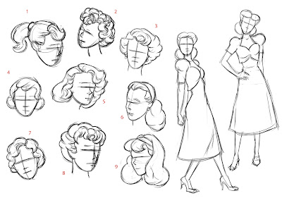
Since the animation will be drawn directly in Flash, I've been completing the final stages of character design in Flash. I picked my favorite, girliest hair styles. These are all supposed to be the same face, based on one of the early sketches I liked.

Right now I don't have a clear favorite. I could go for any one of these.

I also picked my favorite dress styles for Pixie and drew some new mannequins.
I'm finding it a challenge to dress her professionally, but make her look younger than Ruby. Also, these are too similar to Ruby's proportions. (You know I always wanted to make Ruby bigger. Now for contrast I have to whittle Pixie down to almost nothing. Maybe that's appropriate for her, though.)

Here's a quick go at a Ruby/Pixie comparison:

More VanDorn

I found these amazing fox stole pictures. (Fox Stole is a good name for a character) When did it fall out of fashion to wrap something with a head on it around your shoulders?


Here's a couple more takes on Mrs. VanDorn

You know what? I'm thinking this character might be a job for Robin Ator!

Saturday, April 19, 2008

More Pixies

Ignoring her face just now, here's a bunch of dresses and hair styles.


Wednesday, April 16, 2008

VanDorn 1

Here's a first stab at client VanDorn.

Tuesday, April 15, 2008

Trunkated Intro

I figure we move all the credits to the end. Easy breezey new intro. What do you think? (Please forgive the hideous song edit!)

Monday, April 14, 2008

Ruby's Office

I'm desperate not to do extra work, but I'm not sure the office paintings from the short will work in the new series. Though you never see this much at once, here's her office from the short:
In the short it was for the most part just Ruby and she didn't move much. There's three people crowded in there now and all kinds of business going on.

Here it is without the desk and chairs:
I still want it to be dank and cramped but we need a bathroom door and I want to play with the space a little bit.


These are hardly any different. Just slightly different views of practically the same office. Sounds like I meant to do that, but the fact is I'd get started and just end up with almost the same thing again. That last one revives an idea I had for the original short that didn't make it in, and that is a big water heater/furnace/boiler thingy right in her office. Like she pays half the rent of anybody else by taking the boiler room.
I thought doing this might help me. Doing the floor plan made me think about how, for practical reasons, things are laid out as mirror images, so her neighbor would have his bathroom right up against hers. It made me think maybe there was some comic potential in thinking about who might be her basement office neighbor.

As with character design, I think I want to work from storyboards and see where the actually needs of the story determine the needs of the background.

Here's two more sketches that revive an old notion about her office, that she lives there as well. This would make her office a little bit bigger, but still plenty dank and cramped. I've put in a murphy bed (that would usually be put away up into the wall) and sort of a kitchen area with a utility sink, an ice box and a hot plate and a clothes line.


Very glamorous!

Sunday, April 13, 2008

Sound Design Test

My friend David is very enthusiastic about Ruby Rocket and has been interested in contributing to the sound design. Though he has music recording experience, foley is not something he's really done before, so I gave him the animation test to put sound to. I suggested he drop in the coughing, just so it wouldn't be distracting that it was missing, and he added a "OH!" from Ruby after he head slam, but I explained typically we'd have animated to a voice track already.


He did a really remarkable job! The levels could be played with, depending on what you want to hear, I would bring the ambient street noise up and the chair squeaks down, but he put together a really rich and convincing sound environment! I say let's enlist him!

Friday, April 11, 2008

Expression Sheets

Now that some animation tests have gone out I'm really self-conscious of how little information people have on Ruby to work from. So I put together some expressions sheets to help show how her face smooshes around. Some images are drawn from the short, some are from the animation test I just did, and some are new but hopefully representative of Ruby and her general attitude.


Naturally, the idea is that I'll continue to build and refine these sheets as work is done that really seems to nail the character. And of course for all the characters eventually.

Tuesday, April 8, 2008

Some Pixies

Still working on Pixie Stick. Ready for some feedback, I think.


Ways Pixie's intended to contrast Ruby visually:
  • Blond
  • Thin eyebrows
  • Skinnier
  • Younger (17 or 18? I imagine a young girl going to a vocational secretary school instead of high school.)
  • Softer and more conventionally "cheese-cake" sexy, but-girl-next-door innocent to Ruby's (accidental) sultry.
And I didn't have much time for it, but I couldn't resist starting work on this:

Friday, April 4, 2008

Ruby Model Sheet, Take 2

I think you like a slimmer Ruby than I tend to draw. Though the "man-ish" criticism is well taken. Here's a slimmer Ruby with a little more baby fat in the face, not so square in the jaw, bigger eyes. Oh yeah! and new shoes. (Old shoes actually, she's wearing these in the short)

Thursday, April 3, 2008

4s Experiment

Have I actually mentioned how fucking terrified I am by our proposed production schedule? Maybe it's been obvious. I keep looking for compromises in the animation that will get it done faster. The Flash thing didn't work out, not only because I hate how it looked, but mostly because it won't really save any time. I considered dropping the shadow matte process, but unfortunately it's just not a Ruby Rocket Adventure without it. Then I starting playing with the frame rate. I suggested 24fps instead of 30. That bought us a 20% savings, but now I'm thinking we can take that farther.

So here's my latest suggestion...animating on 4s! Here's what it looks like:

And for a larger version you can actually see: http://www.niemannworks.com/rubyrocket/tests/4s.mov

This might be a compromise I can live with, and it buys us a huge savings. I definitely like twos better, but not TWICE AS MUCH!

This scene is 30fps on 4s, coming out to 7.5 cells per second (some seconds will have 7 frames, some will have 8). We could consider going to 24fps on 4s, getting us down to 6 cells per second, but that might be taking the animation quality down a bit too far for my taste. Plus at 24fps, I was anticipating some problems with digital formats, which prefer 30fps (actually 29.97, that's a whole 'nother puzzle to solve later) So 30fps might save some headaches.

It would also be possible to fill in the gaps later. When a deadline is tight, I like to make the project look "finished" as soon as possible. You can't spend the whole schedule making scene one look perfect and neglect the rest. So you get everything painted, you get everything moving that has to be, and then you sweeten the animation as time allows. This 4s notion works really well for that. We can get episodes looking complete, and then continue sweetening based on priorities. And the way After Effects works into our pipeline, new animation should drop right in without any additional work needing to be done on the comps, except to re-render.

I'm starting to like this plan!

Still fucking terrified!

Wednesday, April 2, 2008

Animation Tests Phase 3 and 4

Thought I'd update the blog on how the animation test has been going. I shortened the test so that I could spend more time on the process rather than the animation itself, but I do want to complete this scene because this will be useful to have as a sound design test and for other things.

This is the animation assisting stage done over the rough animation, still drawn directly in Flash.

Typically this would then go to a clean up artist, but in an attempt to turn a negative (no time or money - that's actually TWO negatives) into a positive, this still very rough animation will be the new "look" of the cartoon.

And here's all the elements put together in a comp:


I can live with this, but I think it can be better. Still working on some After Effects magic to tweak the look. For a larger version you can actually see, go here: http://www.niemannworks.com/rubyrocket/tests/comp.mov